- Published on
Week 2
Overview
Day 5, 24th July
The team looked through the feedback from the prof and the TA. Discussed some possible ideas for the concern raised:
Who was your potential user? Is one person enough at this stage of the ideation?
The main demographics will be people between the age of 18-50. It was discussed before, but it kind of got missed out. The main reason is that the team is trying to target user that are more comfortable with technology and also will benefit from the solution rather than have another hindrance. The team also plans to survey more people if time permits to understand the general sentiments of the solution and to identify valuable features to the user. This brings us to the concern the user brought up.
Trusting the solution
The surveyed person mentioned that he might trust the solution opening up accounts for him, but for the transferal of money, not really. The team thought that this is valid concern and thinks that the easiest fix will be to give more control to the user, allowing them to enable and disable certain function. But much like aforementioned, there is not enough data collected to show statistical significance that this might be a demographic wide concern. Therefore, the team will spend this week, while working on a more specific prototype, gather more data on the security aspect of the solution.
Recap from last week
The team started with brainstorming last week and funnel down to 4 major feature:
Autonomous
Less Cognitive Load
Spending Tracking
Simple Visual
How do we achieve them?
Dashboard
- Spending Tracking (Financial Management)
- Simple Visual
Management of Easy spending account
- Spending Tracking
- Autonomous - Optimise Rebate
Management of Long term deposit
- Less cognitive load (less thinking involve in thinking about investing)
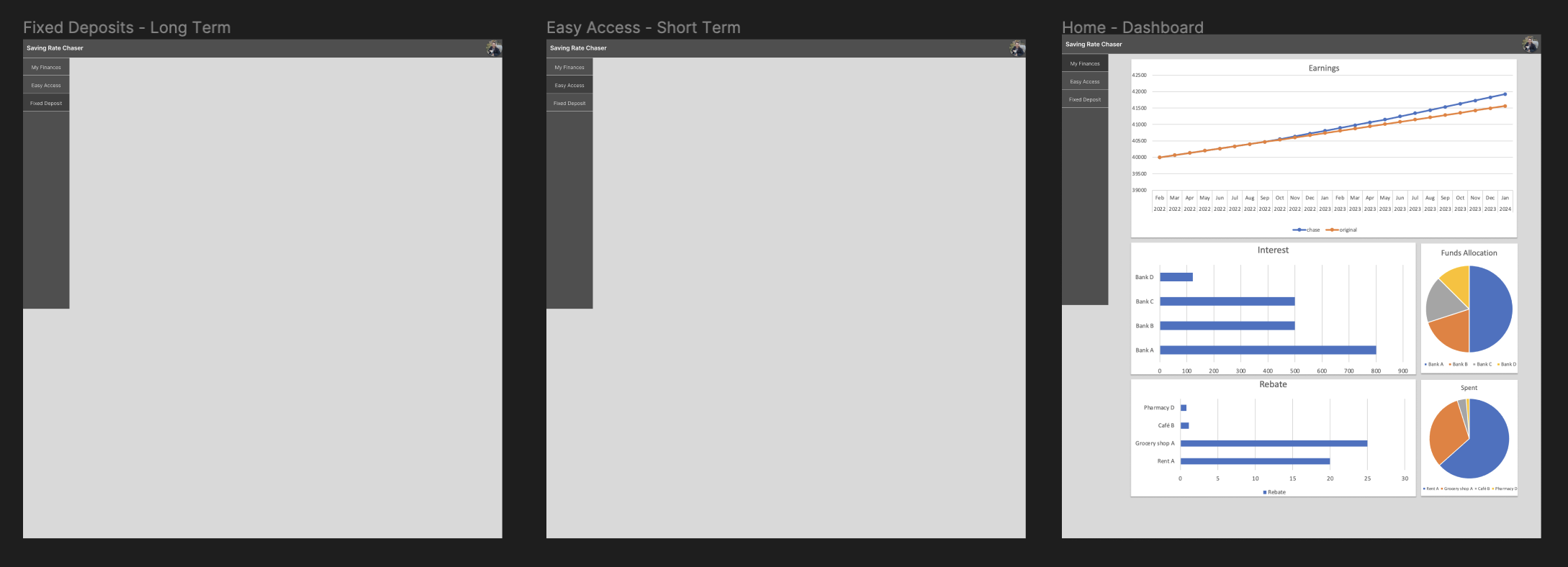
We then proceeded to draw out what we thought the user might want.
This Week
This week we are going to start on more concrete prototyping on figma, but while closing some things that we have learn from our first survey.
The image below is the initial state of the figma, and we will be using them to communicate our ideas to both the user and the client.

Day 6, 25th July
Our team explored two opposing models for managing the transfer of funds between easy access savings accounts in the context of a new, more profitable account type entering the market.
The first approach proposes a fully automated system, where the app would independently transfer funds from the current account to the new, more advantageous one. On the other hand, the second approach proposes a user-driven model, where the account holder would manually perform the transfer between accounts.
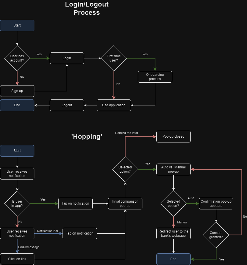
To better understand the strengths and weaknesses of each approach, the team identified three main aspects that accentuated the differences between the two models. In order to fully assess each model’s potential impact, a comprehensive pro-pro chart was developed, outlining the benefits for all three stakeholders involved.
Through this comprehensive analysis, we found that each model offered unique benefits that could significantly enhance our solution. Seeking to integrate these advantages, our team employed a “double-down” strategy, devising a semi-automated money transfer mechanism.
In our proposed solution, the user is given the option to choose how they wish to proceed. They have the option to authorise the system to automatically move their funds from their existing account to the new one or, if preferred, they can perform the transfer manually. This approach aims to blend the best of both worlds, bringing together the convenience of automation with option to fall back to the control offered by manual operations.
Current Goals
- Discuss, showcase, and receive feedback on our current prototype + idea from the client tomorrow
- Finalize our flowcharts (showcasing the workflow of the application), storyboards, and paper prototypes
- Begin to add content to the static website (our digital portfolio)
- Continue working on Figma and on the slides for our team’s recording on Friday
Day 7, 26th July
We met up with our client to discuss our current design and application use flow.

Issues addressed were the onboarding process for new and existing users where tutorials should only prompted for first-time users. Our client initially thought our application would be multi-platform but we managed to clarify with him that the app would solely be a web application but has a function that allows users to receive notifications through their mobile devices.
The client also gave us feedback on our naming scheme for the headings of our website. It turned out the the naming scheme relied on users already understanding what the app is about which would not be helpful for new users. Our client expressed confusion about certain aspects of what the app did due to that. Taking this into consideration, we made changes to the names to make it straight-forward to understand at a glance.
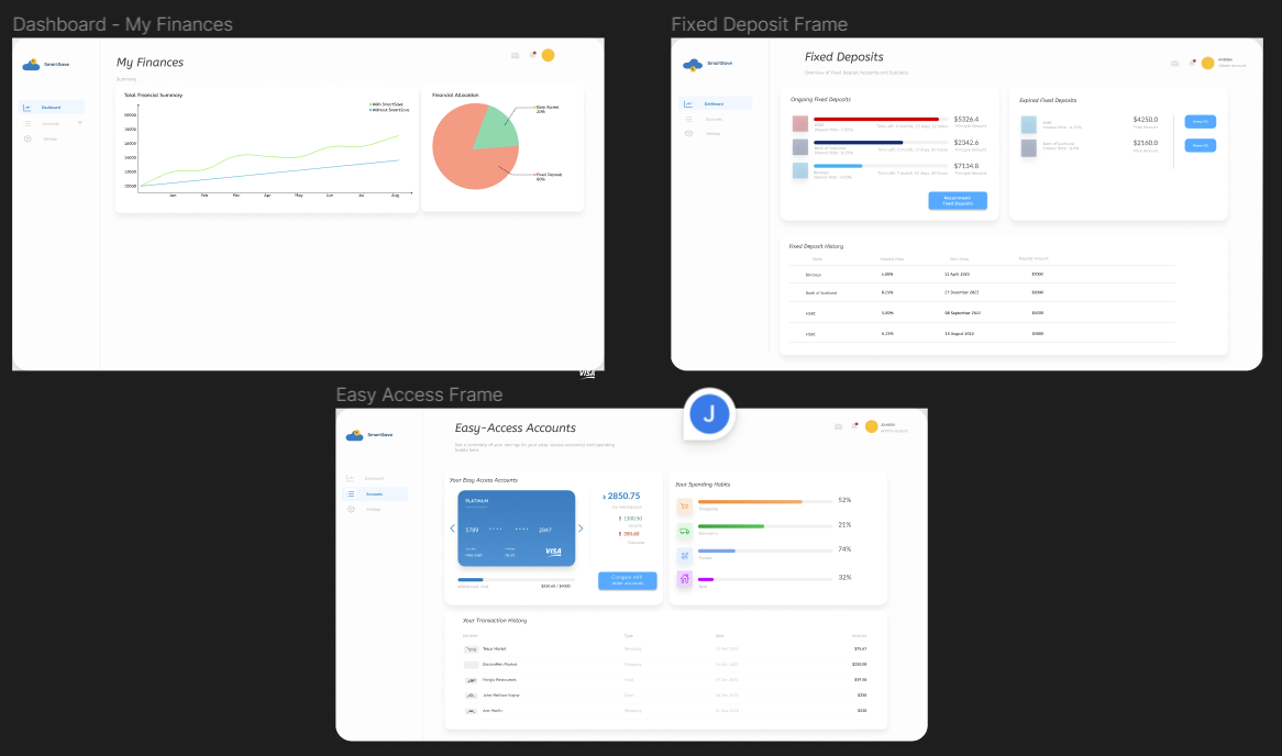
Feedback was given on how we should allocate information on the main landing page. As it is, the page contained too much information and our client suggested to split some of the information into the other pages such as rebates/cashback into the easy-access page. This approach aims to reduce the cognitive load on the users where the information displayed relates to the actual page instead of being a complete overview within a single dashboard.

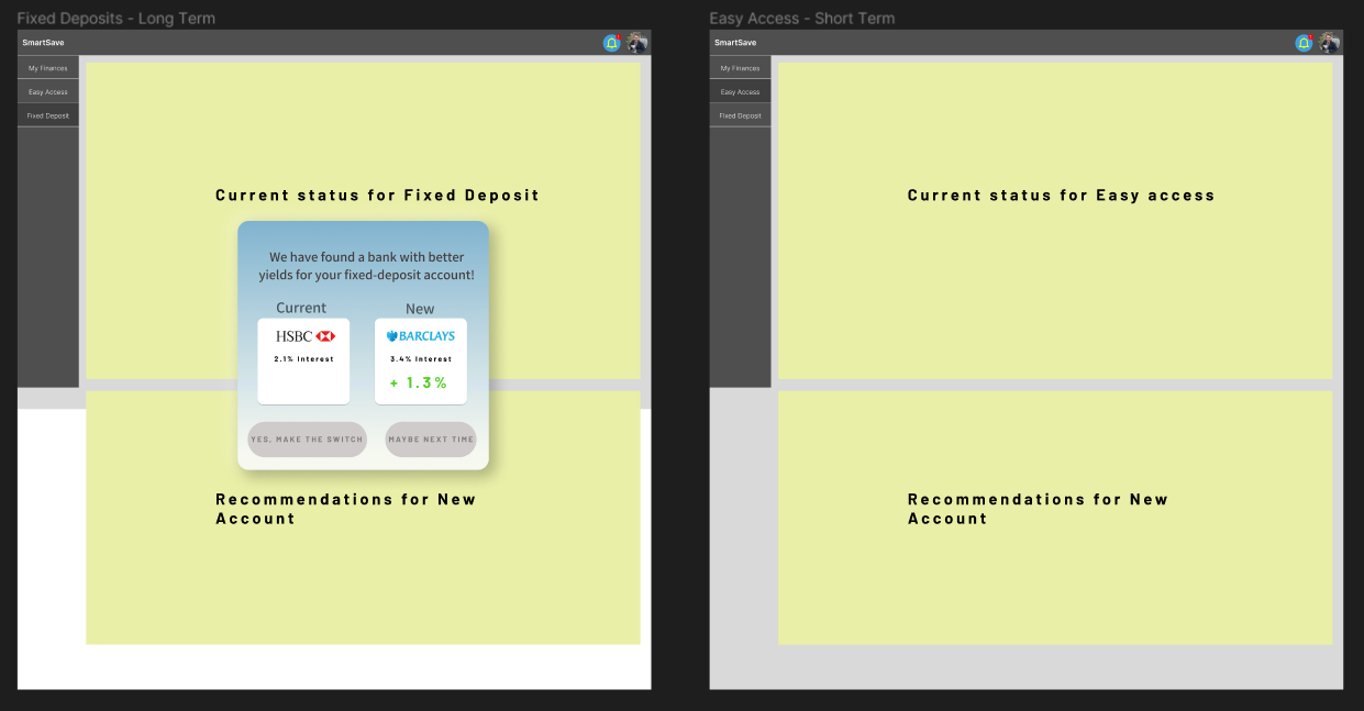
At the moment, we have designed a pop-up that would appear upon clicking the notification bell that seeks the permission of the user to make the switch from their current bank to a new one.
We plan on improving the overall design of the website and integrating the feedback given by our client.
Current Goals
- Begin to add content to the static website (our digital portfolio)
- Continue working on Figma and on the slides for our team’s recording on Friday
Day 8, 27th July
We are still currently in the process of making the changes listed by our client to our Figma prototype. Here’s how the new version looks like:

We also want to make sure that we have a Figma prototype that is >75% completed by tomorrow so that we can perform the user testing to gather feedback on the application for the pitch video as well as to gain better insight regarding our current application (and how we can further improve it)
Current Goals
- Continue to add content to the static website
- Start working on the poster
- Finalize Figma prototype by tomorrow so that the user testing can begin
Day 9, 28th July
We made some significant strides today by conducting think-aloud usability tests. This gave us the opportunity to understand the user's interaction with the application from their perspective. We asked testers to verbalize their thought process which helped us gain insights into their user experience and identify potential points of confusion or frustration.
To gauge the usability of the application, we provided tasks such as finding out their spending habits, comparing the different account types for Fixed Rate accounts, account "hopping" for Easy Access account, and renewing their expired Fixed Rate account.
Here's what we found out:
- Visual cues of bars helped users understand where they spend the most.
- The sort feature for the table will help users find accounts that are suitable for them.
- Users liked that the colors helped them understand the benefits and regressions of the potential new account.
- Abbreviation of “Fixed Rate” as FR was confusing for users.
Based on these findings, we've been able to draw some key implications:
- Use of Colors/Visual Cues: The use of colors significantly improved user understanding and experience. The use of bars to represent amounts also aided users with numbers. We will continue to integrate colors and visual cues throughout the solution.
- Sort functionality: Users showed interest in a sort function in the tables displaying savings account options. This implies that sorting can be implemented for other tables in the solution.
- Use of Abbreviations: Some users found the abbreviation of "Fixed Rate" to "FR" confusing. Moving forward, we will avoid the use of abbreviations in our solution.
This also marks the end of week 2! We plan to polish and finish the Figma prototype by next week so that it can be ready for the exhibition.