Project Process

This page showcases the daily activities involved and the team's thought process throughout the development of our solution.

Project Timeline


Team Reflection

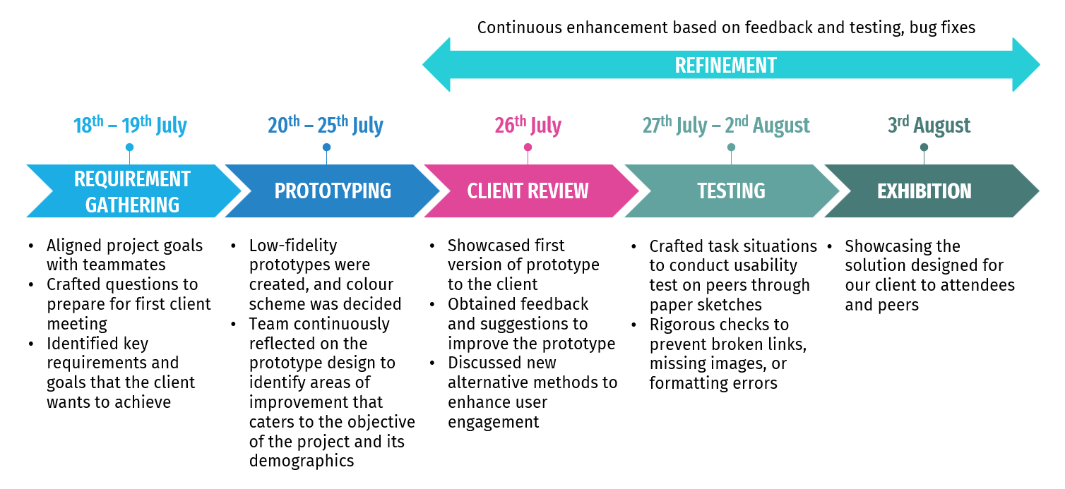
The team has gained many valuable lessons in this exhilarating 3-week journey to design a solution for our client, The Annexe. In the beginning, we faced uncertainty, with zero knowledge about the client, their expectations, and the module as a whole! However, as each day passed, we were taught new skills and strategies on how to achieve our goal. Lectures equipped us with essential knowledge for solution design, covering topics such as shared mental models, effective client communication, prototyping techniques, and usability testing. These information guided us through each phase of our development journey as shown in the project timeline above.


During Phase 1: Requirement Gathering, we learnt the importance of not just understanding what the client wants, but also the alignment of each team member's understanding of the project and goals. We have to ensure that everyone in the team is on the same page in order to foster a cohesive and synchronised approach when communicating with the client. We also learned that clients often face uncertainty about their specific requirements or may be unclear about the full extent of our team's capabilities, making it challenging to pinpoint the exact goals they wish to achieve. This taught us the importance of adopting a flexible approach to structuring our questions during client interactions and probing for more details to gain a better understanding on their needs, enabling us to come up with more targeted prototypes in the next phase.


In the Prototyping phase, we experimented with paper prototypes and decided on developing a website as the solution for our client. Through this process, we learned how to put ourselves in the shoes of the intended users of the website. Due to a significant proportion of older individuals in The Annexe, we understood the importance of considering their unique constraints and needs. Our aim was to ensure that they could enjoy the product we created just as much as other user groups. One of the main constraints we identified was poor eyesight among some older users. To address this, we enhanced our solution's accessibility features such as increasing the font size and implementing text-to-speech so that the older users do not have to solely rely on reading to consume information, thus making our solution more inclusive and user-friendly.


The team also conducted continuous refinement of the solution through feedback from the client or team members and which enabled us to identify new areas of improvement and pain points. We learned about crafting task situations for usability testing, which is important as it helps us assess how well users interact with our solution in real-world scenarios. While we may naturally understand what we developed, it is crucial to test it on a diverse group of people to ensure that it is universally understandable and usable.


Throughout this journey, we were also confronted with various challenges, including time constraints and uncertainty regarding the completeness of the solution. The short duration of this module placed pressure on the team as deliverables had to be submitted within a tight timeframe. This taught us on the importance of prioritising tasks, proper time management and setting realistic goals. We were also unsure of the level of completeness our solution should achieve to both satisfy the client's requirements and align with the module's scope. To overcome this challenge, the team proactively consulted the professor to clarify the deliverables expected from us and engaged in open communication with our client to manage their expectations and maintain transparency.


Although we were unable to deliver a fully functioning website, we take immense pride in the work we achieved within the given constraints. The client's positive reaction during the review and exhibition served as a strong affirmation of the quality of our efforts. As we venture forward, we carry this invaluable experience and knowledge with us, inspired to create meaningful solutions that leave a positive impact on the world.


For a more in-depth look into our team's design process throughout the three weeks, continue scrolling to view our dailies/diary. Alternatively, you can use the shortcuts below to quickly access them:


Requirement Gathering

Prototyping

Client Review

Testing

Exhibition

Final Day

18th July 2023

The team met up for the first time today. We started off by aligning our goals and understanding on the project, ensuring that everyone is on the same page. Afterwards, we prepared a set of comprehensive questions for our first meeting tomorrow which serves as a guide for us to obtain a deeper and clearer understanding on the project’s scope and deliverables.

The questions we will be asking are:

  1. How would you describe your community demographics?
  2. Who are the primary users or contributors to your activities?
  3. What are the specific activities and programs by the Annexe Communities that need to be captured and showcased in the new system?
  4. Could you elaborate on the challenges the Annexe Communities currently face in recording and reporting their activities?
  5. What is the current level of digital literacy within the community? Any specific hurdles?
  6. Are you open to providing digital literacy training or tutorials for the community members to use the new system effectively?
  7. Are there any key features are you looking for in the new system?
  8. Are there any specific platforms or tools that the Annexe Communities are already using or would prefer to utilize for the archiving system? Alternatively, are there any platforms or tools that they would like to avoid using?
  9. What are your expectations from the new system for capturing, organizing, and sharing your work?
  10. How would you like the resulting archives to be interactive and community-oriented?

Based on the project brief, we have identified some of the key requirements and issues faced by the organization which we will further clarify during the meeting to ensure effective collaboration and to establish cohesive team dynamics. Our priority tomorrow will be to get to know the organization better and to obtain as much valuable information as we can so that we can proceed to brainstorm ideas and create prototypes.
19th July 2023

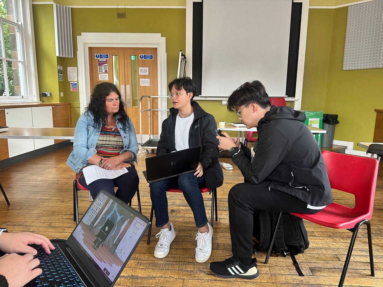
The team, together with Team 5A, met with the client for the first time today. Leveraging the questions we prepared the previous day, we gained a deeper understanding of the client’s expectations and were able to align our development objectives. We were able to identify the key requirements and goals that the client wants to achieve through the archival system:

  1. Create a straightforward design that highlights the events conducted and the rich history behind various art pieces created by the community within The Annexe’s building
  2. Allowing the system to act as bridge to connect with younger audiences
  3. System should preferably be accessed through portable handheld devices, e.g. mobile phones or tablets

The first requirement is catered to the current demographic at The Annexe, which mainly consists of elderly individuals aged 60 and above. Their lack of technological expertise requires our design to be extremely user-friendly to guide them through the application. The team came up with several suggestions to improve usability, such as increasing the font size, incorporating more images to support text descriptions, and introducing audio narrations to aid the elderly with poor eyesight.

Regarding the second requirement, the client mentioned that Annexe Communities provides help to people aged 18 and above, however, the majority of the members are older people. She wishes that the system is able to attract individuals of all age groups, especially from the younger demographic so that they can foster a sense of unity and reinforce the community bond. The team thought of creating an Instagram account as it is one of the more popular social platforms used by the younger generation. However, we had our doubts on whether this approach is feasible as it seem to be out of the project's scope. Additional work will have to be done by the Annexe staff to run the Instagram account frequently. Hence, we will be finding an alternative approach instead.

For the third requirement, the client's expectation was to have the members or visitors carry a handheld device during walks in the Annexe building and the device will provide information about the particular spot in the building. The team initially thought of creating a mobile app that can be used on phones and tablets. However, due to time constraints, creating a mobile application might not be a feasible plan as it requires more time to develop as compared to a web application. Hence, the team decided to work on a mobile-friendly web application that is suitable for both laptops and mobile devices.

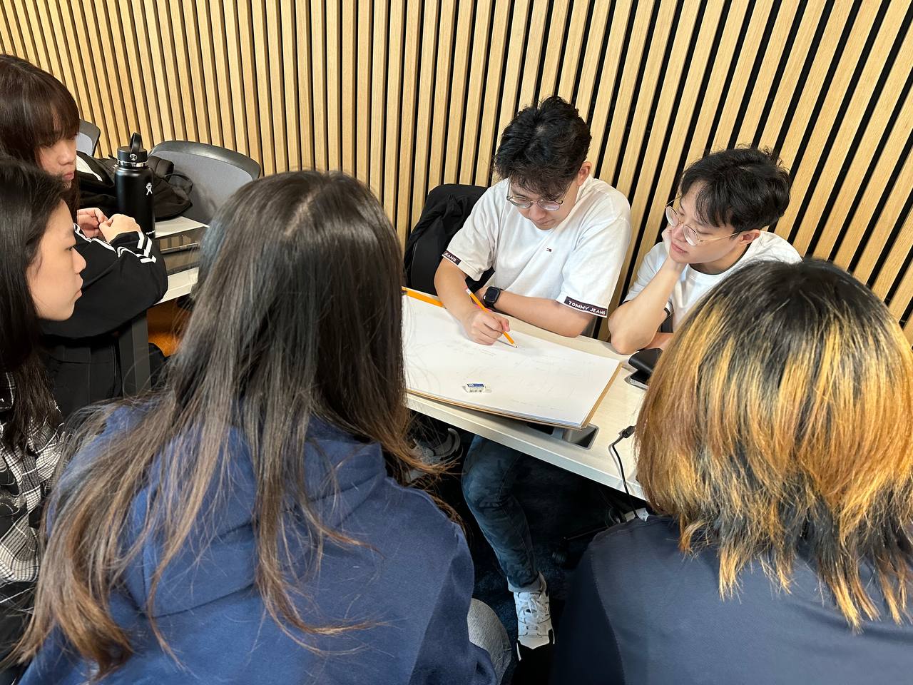
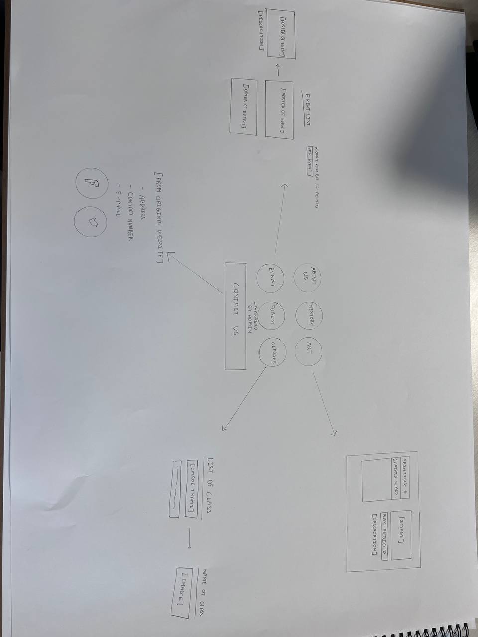
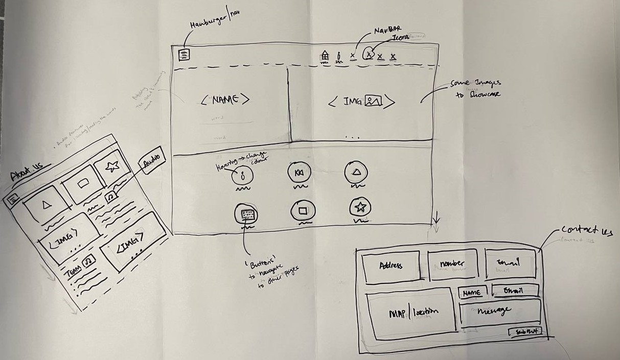
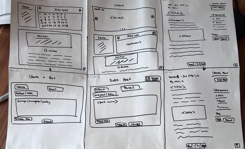
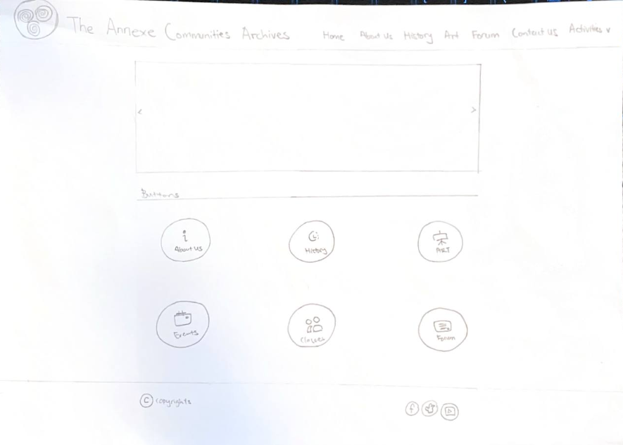
After receiving valuable information from our client, the team started working on the low-fidelity prototypes using paper sketches to map out the designs of our web application. Our immediate task for tomorrow will be to focus on structuring the layout for the web application based on the low-fidelity prototype and identify any potential challenges so that we can address them promptly.

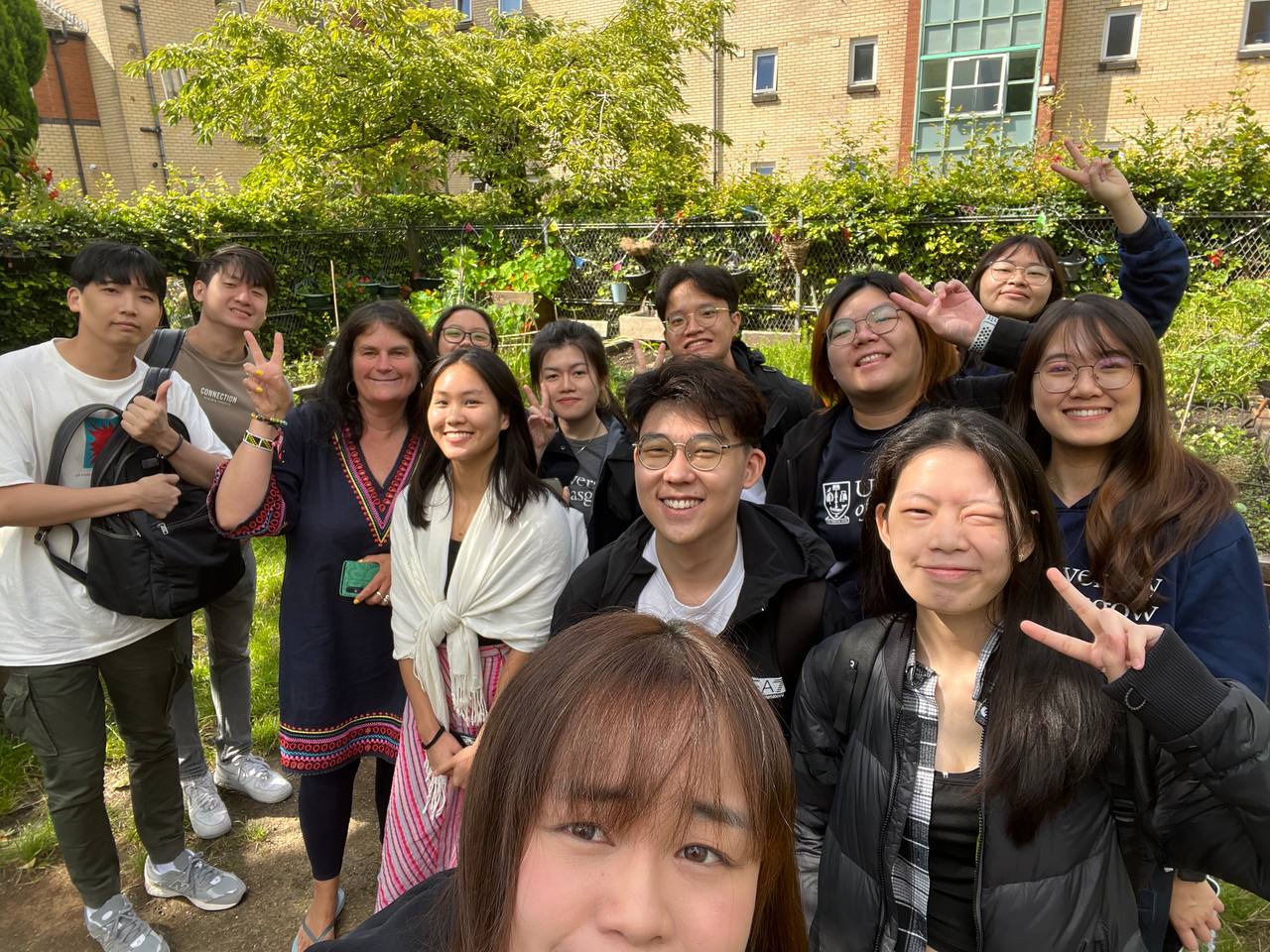
Group photo with client

Group discussion after client meeting

Low-fidelity paper sketch prototype

20th July 2023

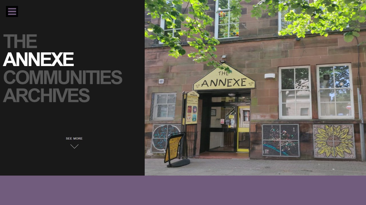
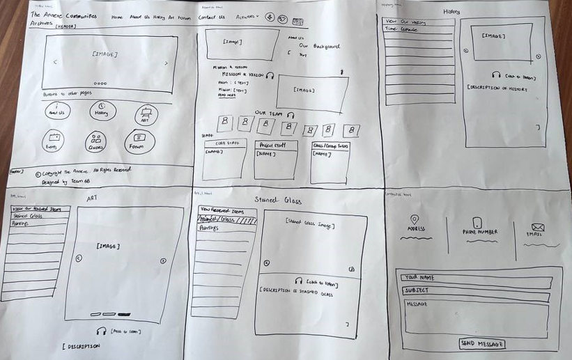
Today, the team made further progress in refining the low-fidelity prototype of the web application. After confirming the initial prototype yesterday, we shared a screenshot with the client, who responded positively to it. Subsequently, the team began the development phase using HTML and CSS. The team finalized the main pages of the web application, which include the:

  1. Homepage
  2. About Us
  3. History
  4. Art
  5. Events
  6. Forum
  7. Classes
  8. Contact Us

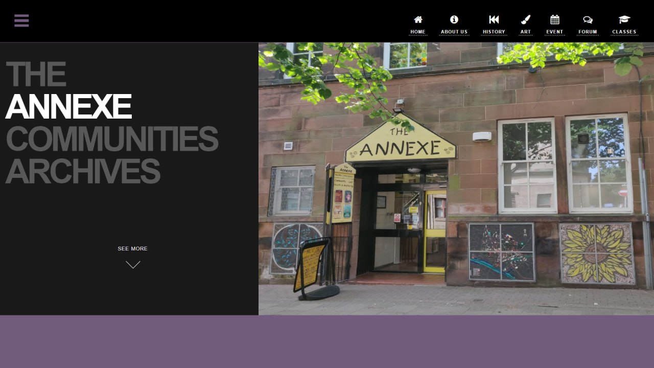
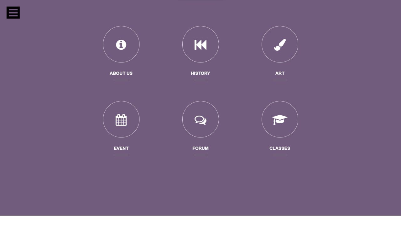
Additionally, the color scheme was determined, with the main colors being purple, black, and white. The base layout of the homepage has been completed, with some minor improvements scheduled for later. Moreover, buttons to navigate the About Us, History, Art, Event, Forum, and Classes pages have been created.

One significant challenge encountered today was arranging the contents on the homepage. Given that it incorporates images, texts, and animations, the team exerted extra effort to categorize and arrange them meticulously to achieve a visually appealing webpage. Fortunately, the team managed to resolve the majority of the issue, with some minor bugs that will be addressed on the following day.

Initial homepage design

Homepage with navigation bar

Buttons to allows quick access to other pages

21st July 2023

During the lesson today, the team was given the opportunity to ideate and explore new ways to design prototypes. We learnt about other non-conventional prototyping methods as well as methods to improve user experience. Through this process, it made us re-evaluate on the initial prototype that we designed. One major issue brought up by the team was the color scheme of the website.
The previous color scheme consists of colours such as dark purple and grey against a black background. The team felt that these darker colours made the website look dull and did not reflect the positive and vibrant vibes that The Annexe is conveying. To tackle this issue, we chose a new colour scheme for the website. The current colours consist of a white background with black and purple fonts to create contrast.

With this in mind, the team proceeded to design the prototypes for the other pages such as the About Us and Contact Us page. The team's next step is to finish up the prototypes for the remaining pages such that we are able to update the client and receive early feedback on it.

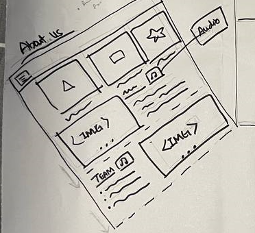
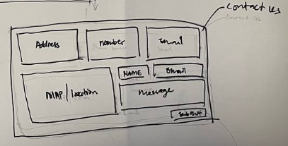
Prototype for About Us and Contact Us page

About Us page (Zoomed In)

Contact Us page (Zoomed In)

24th July 2023

After completing all the pages of the prototype over the weekend, the team gathered to discuss improvements as part of our continuous refinement process. The focal point of our discussion revolved around a crucial question: "How user-friendly is the website for The Annexe's target demographics?" The team established once again that our goal is to create an aesthetically pleasing website that is able to cater to the common issues faced by the majority age group at The Annexe which are poor readability and limited computer literacy.

Based on the main question, we focused on improving the website's visibility, including font sizes, icons, and buttons. Firstly, we enhanced the font size of the navigation bar, making it larger than the original, and removed unnecessary icons to achieve a neater and more straightforward design. Secondly, we incorporated a headphone logo to represent audio playback, ensuring it is both prominently placed and of sufficient size for easy visibility. On the Contact Us page, we prioritized the three most important pieces of information: the address, phone number, and email address. Each of these details is now prominently displayed at the top of the page, with bolded text and a corresponding icon for added clarity.

The team aims to finalise the 2nd version of the prototype by tomorrow, 25th July, as we are planning for a meetup with the client on 26th July to get feedback on the current prototype.

Refined prototype for Forum page

Refined prototype for remaining pages

25th July 2023

The team learned about opposing mental models and the Pro/Pro chart in today's lesson and we managed to use them to identify the areas in the website that can be improved on. One area we pinpointed was the text-to-speech icon, currently represented by a headphone. Some team members felt that a play button or an audio button might be a more intuitive design, while others argued in favor of keeping the headphone icon.

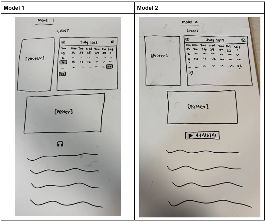
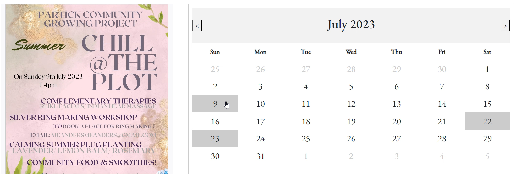
Another conflicting model we had was the design of the calendar. The initial design was similar to the iPhone’s calendar, with a dot below the dates that had events. However, some of us felt that the dot was too small and might pose difficulties for the current demographics, which primarily consist of elderly people aged 60 and above. Considering their potential difficulty in seeing the small dot, we created a second design with the dates with events to be highlighted instead.

We grouped the headphone logo with the highlighted dates as Model 1 and the play button with the dotted dates as Model 2. Through thorough discussion and consideration of each model's merits, we ultimately reached a consensus: to include both the headphone logo and the play button in the final design. The headphone logo possesses an intuitive nature and higher recognizability, while the play button serves as a better signifier to guide users, letting them know that there is playable audio. As for the calendar, we decided to go with the highlighting of the dates with events, ensuring enhanced visibility for all visitors to the website.

The team will be finalising the second prototype by today and we will be consulting with the client tomorrow to gather her inputs on the design and discuss any modifications required.

Essential components in each model

Visualization of each model

Pros of each model

26th July 2023

We had our second client meeting today and showcased our prototype to our client. We received satisfactory feedback from her as well as some suggestions to improve on the prototype. The first suggestion was to increase the font size for the text descriptions. In the previous refinement, the team focused solely on increasing the font size of the navigation bar to allow users to browse the website easily; however, we missed out on the text descriptions of the main contents.

Next, the client wanted to include more images of their event posters as well as posters for their classes. She felt that some people preferred to view images before making a decision to visit and sign up for their classes. Hence, we will be changing the singular image of the event posters to image carousels instead so that more images can be included. The last suggestion given by the client was to add a function allowing website administrators to directly upload new events or classes. This would make it easier to record day-to-day activities.

The team then discussed with the client about the headphone and play button for the text-to-speech feature, and she agreed that combining them was a better idea rather than having them displayed individually. We also proposed placing QR codes near the art pieces in The Annexe, enabling visitors to scan them and receive audio explanations. The client expressed her satisfaction with the proposal and gave us the green light to proceed. Before the meeting concluded, the client provided us with a thumb drive containing additional archives to be displayed on the website.

With the feedback and resources we have received today, the plan for tomorrow will be to filter through the resources given to us and upload them onto the website. We will also implement the suggestions mentioned such as increasing the font size, combining both headphone and play button for the text-to-speech function, and the replacement of the event posters to an image carousel.

Second client meeting to showcase our prototype

27th July 2023

Today, our team held a meeting to discuss the valuable feedback received from both our tutor, Yuxin, and our client, Jane. We diligently listed down the tasks for the day, arranging them in order from the least time-consuming to the most. Creating a to-do list was essential, focusing on the additions Jane requested for the website. The primary topic of discussion during the meeting revolved around the icon used for the text-to-speech function. Yuxin wisely pointed out that icons can be highly subjective, varying based on personal preferences. Considering this, we deliberated on the best approach, as having multiple icons might overwhelm users and lead to confusion.

After a thorough discussion, we arrived at a finalized idea that strikes a balance. Our decision is to add the text “Play Audio” beside the headphone icon. By doing so, users can either read the text label, which will have a significantly larger font size than the rest of the description, or they can refer to the icon to utilize the text-to-speech function seamlessly on the website. This way, we are able to improve the user experience on our website and create a more inclusive one that can accommodate more individuals.

Our goal for today will be to complete the filtering of the images provided by our client yesterday. As there was a huge amount of media provided, we required an extra day to sieve through the more significant ones that can be shown on the website to fully represent the best of The Annexe.

Task list with projected time consumption for each task

Finalised idea for Text-to-Speech button

28th July 2023

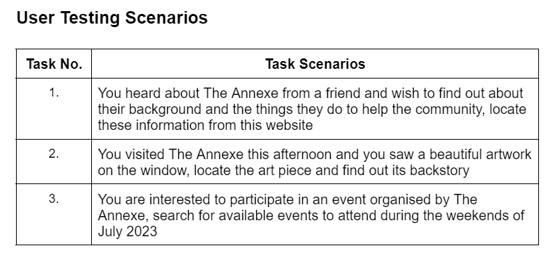
In today's lesson, we learnt about user testing using paper prototypes to test how intuitive the website is to visitors who have not seen it before. To do so, we created sketches of the web pages we have done so far and put them to the test by asking friends to “play test” the website once we have crafted suitable questions. One of the things we learned today was to not give leading prompts. This was interesting as we did not think much about the questions we asked during user testing on previous projects and it got us thinking on how to improve the questions that will be asked during the user testing. With this, we tried to incorporate this idea for the questions we crafted for the user testing.

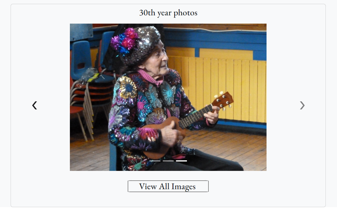
After which, we placed our focus on completing the image carousel for the Events page which was part of yesterday's to-do list. This allows for the posters of different events to be cycled through and showcased on the website. We have also included photos that we have received from the client, Jane, that were taken during the various events that they have had so far. This was one of the things Jane wanted to do as it allows for the visitors or even staff and members who participated in these events to look back at the photos and have a sense of nostalgia reliving those moments.

With this, we aim to tidy up and complete the website by 2nd August to give us time to look through and ensure that the work is of quality. We will also be performing our user testing on 31st July so that we have enough time to make any changes before the deadline.

Sketched web pages for user testing (Homepage)

Crafted task scenarios for user testing

Image carousel for Events page

31st July 2023

This afternoon, the team had a consultation session with Yuxin to gather feedback regarding our website. One of her suggestions was to add visual cues, such as changing the cursor to a pointer when hovering over clickable images or links, so that users know they are interactive elements. Another important suggestion was to incorporate a back button on the website to allow users to retrace their steps easily, without the need to navigate manually. This enhancement will improve user-friendliness, especially for mobile users who may find it challenging to repeatedly use the smaller browser back button, particularly for elderly users who may have difficulty noticing it.

The team will be working on these enhancements and simultaneously preparing for the exhibition poster which will showcase our product to both clients and peers.

Back button to improve retraceability

Cursor changing to a pointer to indicate clickable item

1st August 2023

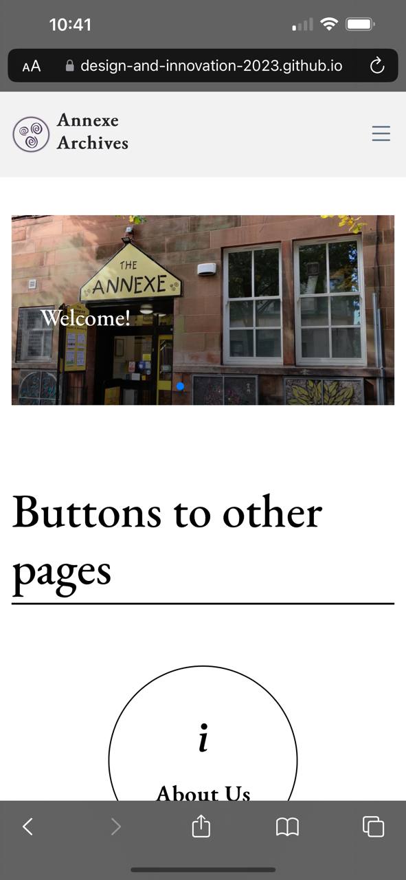
The team was split into 2 groups today, one focusing on the website development and the other focusing on the poster design so that we are able to fully concentrate on each part and finish both as soon as possible. There were some issues faced today during the development where we realized certain scripts were not working within the website. We managed to fix majority of the issues except the media query for the phone view which we will be resolving as soon as possible. After which, we hosted the website through Github pages such that our website will be publicly available for viewing.

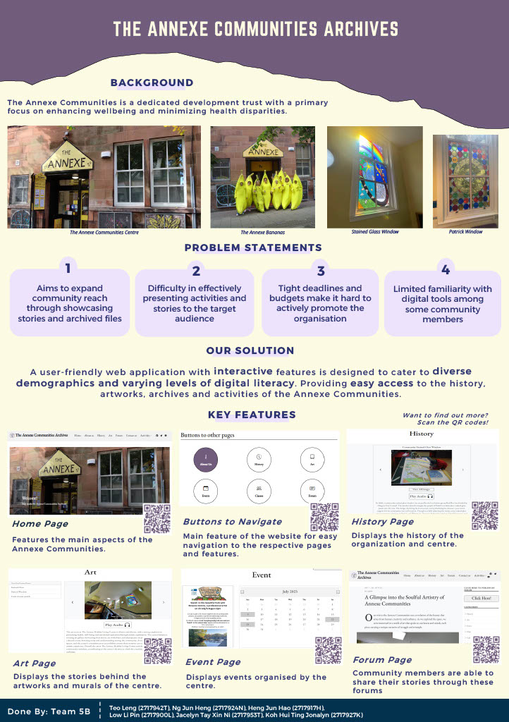
As for the poster, the team went in for a consultation today regarding the current version of the poster as we felt that the poster was too wordy and was confused in which direction we should take. The main issue was its wordiness, which overwhelmed the key message we wanted to convey. To address this, we decided to streamline the content, focusing on the most critical information and removing unnecessary details that distracted from the core theme. We narrowed it down to the background, problem statement, solution, and key features. Additionally, we made sure to include more images, increase the font size, and add QR codes to allow visitors to view the actual website, making the poster more engaging.

Our goal for tomorrow will be to fix the media query on the mobile version of the website, conduct a final runthrough of the website to ensure that everything is working as intended, and finalize the poster design.

Exhibition poster

2nd August 2023

Today is the last day before the exhibition tomorrow, our agenda for the day includes two crucial tasks: finalizing the website and conducting thorough testing and preparation for the exhibition. We first started with finalizing the poster, making sure that the poster is concise, visually appealing, and can effectively convey the message we wanted to share with the exhibition attendees.

Moving on, we did a final check on the website for its responsiveness across different devices, such as laptops, mobile phones and tablets. We also conducted thorough checks to identify and resolve any technical issues like broken links, missing images, or formatting errors. By conducting these tests rigorously, we aim to eliminate any potential hiccups that might hinder the success of the exhibition.

With everything in place and our spirits high, we eagerly anticipate the exhibition day, excited to share our efforts with the clients and peers, as well as making a meaningful contribution to the event!

Our website viewed through a mobile phone to test for responsiveness

3rd August 2023

Today was the long-waited exhibition. The team was thrilled to finally showcase our hard work to the public and share the results of our efforts. During the exhibition, the feedback from our client, Jane, was incredibly positive. She expressed her utmost satisfaction with the website, which brought a sense of accomplishment and pride to our team. Knowing that our work had met and exceeded her expectations was truly rewarding.

In addition to the exhibition, we also made sure to promptly email Jane all the documents she had requested. This further strengthened our relationship with her and demonstrated our commitment to meeting her needs even after the project’s completion. Overall, we felt honoured and grateful for the opportunity to work on such a meaningful project and we look forward to the future developments of the website and further collaborations with Jane and other clients.

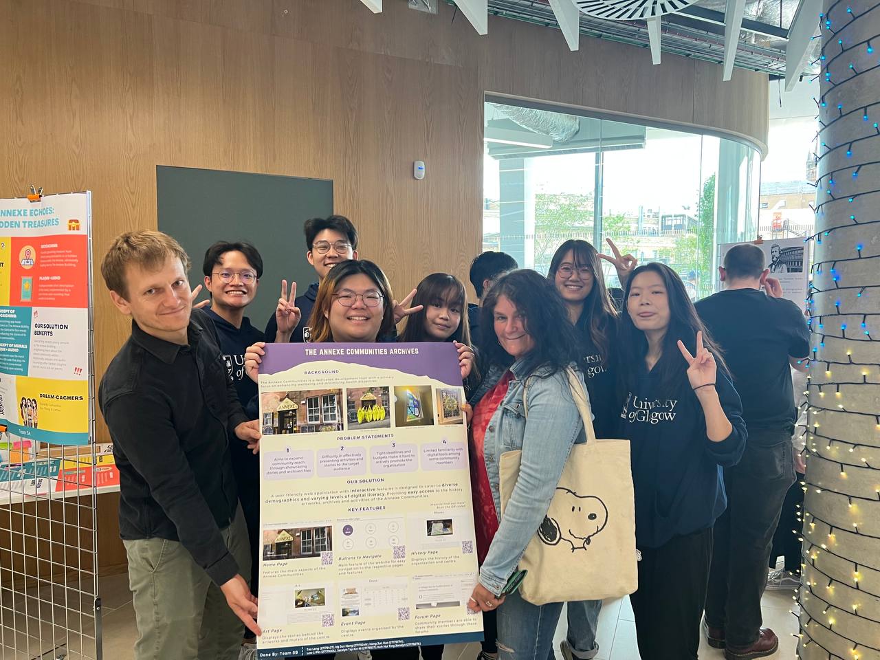
Group photo with Jane and Prof. Jonathan at the exhibition

4th August 2023

Today marks our last day here in Glasgow. It has been an amazing journey throughout these 3 weeks and a truly eye opening experience for us. Beyond the enriching lectures and engaging projects we undertook, this trip has offered us invaluable lessons in personal growth and independence as we lived away from home, both alone and with friends. Throughout our time here, we not only had the privilege to learn from our professors and teaching staff, allowing us to gain valuable insights and broadening our horizons, but also push us to think more critically and creatively to solve the problems that we were presented with. This pushed us past our comfort zone and helped foster a sense of collaboration within our team.

However, it is the experience of living in a new environment, away from the familiar surroundings of home, that has truly shaped us. Navigating daily life in a different city, learning to be self-reliant, and adapting to the culture and routines of Glasgow have been invaluable life lessons. We've encountered diverse perspectives, made new friends, and discovered strengths we didn't know we possessed. As we reflect on this journey, we realize that there is so much more to learn and explore in the world. This experience has shown us that there are endless possibilities waiting to be discovered beyond our comfort zones. It has taught us that growth happens when we embrace change and step outside of what we know.

We would like to extend our gratitude to all those who made this journey possible—the educators, the organizers, our fellow participants, and the people of Glasgow who warmly welcomed us into their city. Thank you for this unforgettable experience that has opened our eyes to the vast possibilities that lie ahead.