Prototype 3
High-Fidelity Prototype
Moving forward, the team is now ready to create the high-fidelity (hi-fi) prototype, where the idea of the lo-fi prototype will be translated into a more detailed representation, similar to the application. With this prototype, the team will be able to further improve the user experience and functionality of the application. This prototype focuses on the donation process that users encounter during their initial login as part of setting up their account which was mentioned previously in the storyboard, first-time user. By creating the hi-fi prototype, the team aims to bring a user-friendly and simple donation process to the user when using CharitAble.
Prototype Design

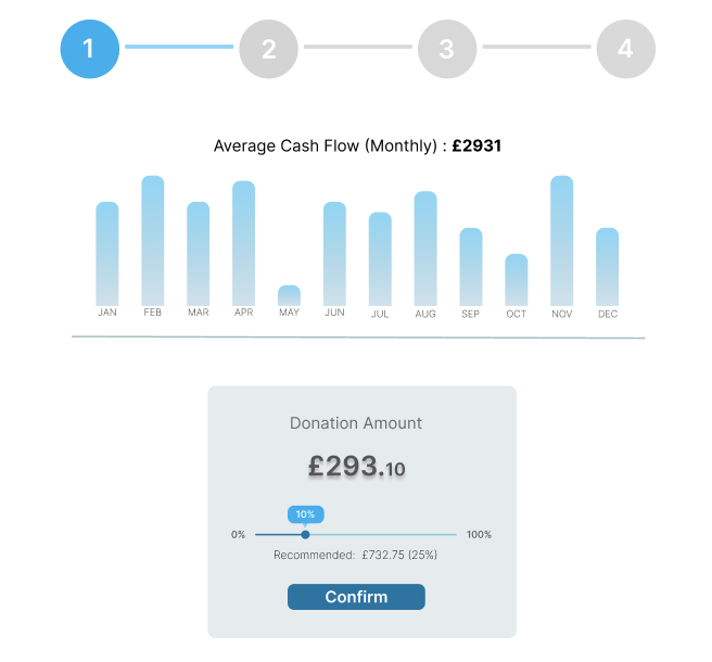
The first stage of the donation process shows the user's average monthly cashflow where he or she can set the amount of percentage they want to donate. As shown, the recommended amount is 25% which is what the team gathered from the first prototype. Upon selecting the donation amount, user clicks on confirm and they will be directed to the next stage.

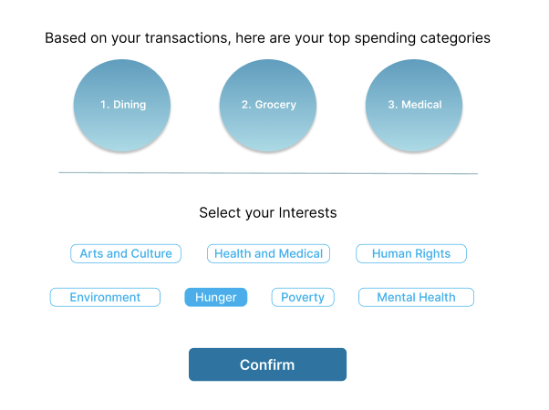
At this stage, the user top spending categories will be displayed where their interest will be preselected for them based on these categories. This stage comes from the feedback gathered in the first prototype where users would prefer selecting their interest before selecting the charities. Users will have the option to amend their interest before clicking on confirm where they will be redirected to the next stage.

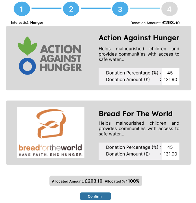
After selecting their interests, users will be presented with a list of different charities related to those interests, which they can scroll through to explore. They will have the freedom to allocate a specific percentage of their donation to each charity, giving them the option to support multiple causes. Once the total donation amount is fully allocated to different charities, users can click the "confirm" button to start donating and they will be redirected to the summary page.

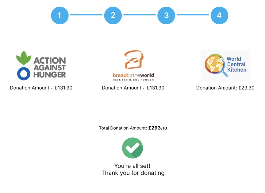
At the final stage of the donation process,a confirmation page is displayed, stating that the donation has been completed. This page also includes the charity details and the allocated amount.
Conclusion of Prototype
In conclusion, the team has made significant progress in the design process by developing a high-fidelity (hi-fi) prototype that refines and enhances the user experience. This new prototype, based on the lo-fi concept, brings a user-friendly and straightforward donation process to CharitAble's users, especially first-time users during their initial account setup.
To ensure the prototype's effectiveness and user-friendliness, the team conducted user testing to gain valuable feedback from users on how it can be improved. The feedbacks gathered are shown below.
Insufficient details: According to user feedback, there is a lack of sufficient details provided on each stage, leading to uncertainty about what to do at each step. This issue arises from the absence of clear instructions given in each stage.
Redundant Spending Categories: Users feedback that they are unsure how the top spending categories are related to their interest.
Selection of Charities and Donation Percentage: Users feedback that this stage can be confusing as they are unsure how to unselect a charity and that allocating 0% is possible. The primary factor behind this is that users select their preferred charities by allocating the donation percentage, resulting in a 0% allocation for the charities not chosen. Furthermore, presenting the donation amount can cause confusion for users, as they are primarily interested in allocating donations based on the percentage of the total donation amount.
Lack of Summary Page: Based on user feedback, they expressed surprise at their donation being processed immediately after allocating the donation percentage to different charities. Users commented that they would prefer a summary page displaying donation details before confirming their donation, providing them with a chance to review the information.
With meticulous attention to detail and the insights gathered from user testing, the hi-fi prototype will offer a more immersive and polished representation of the application, enabling the team to further refine its functionality, interface, and user flow. The successful implementation of user interest selection and allocation to charities showcases the team's commitment to delivering a personalised and meaningful donation experience.
Try Our Prototype!
You can directly try this prototype below or if you would like to try it in the Figma app, simply click here