Prototype 4
High-Fidelity Prototype (Improved Version)
The next step in the design process involves creating an improved version of the previous hi-fi prototype, which is a result of the team's extensive deliberation and determination to enhance the donation process. Through thorough consideration and careful analysis of insights and feedback gathered during the user testing phase, the team has spent considerable time brainstorming and exploring innovative ways to refine the prototype. By iterating on this enhanced prototype, the team aims to fine-tune the functionality, interface, and user flow, ensuring a seamless and impactful donation experience for all users. This dedication to continuous improvement reflects the team's unwavering commitment to delivering a user-centric and purposeful platform for charitable giving.
Prototype Design
In contrast to the previous prototype, the improved version of the prototype now comprises five stages of the donation process instead of four. Additionally, all the pages includes a header, "Set Up Your Account", and a short description, informing the users the purpose of this donation process.
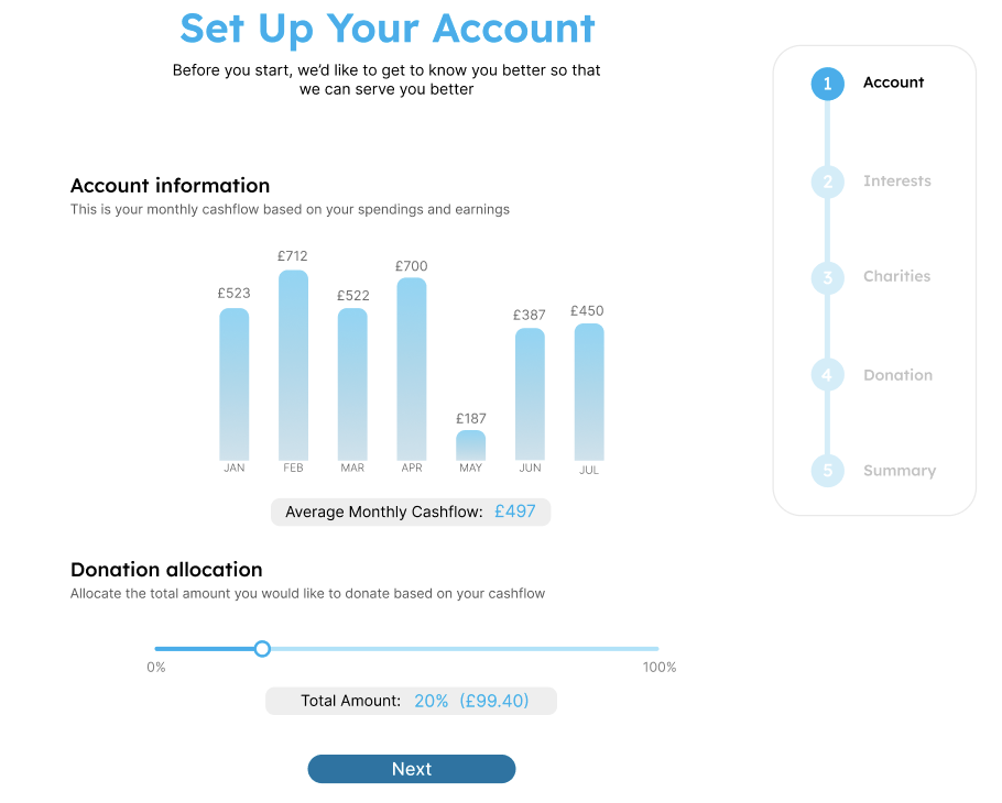
Unlike the first stage in the previous prototype, this stage of the current prototype features a descriptive explanation of the graph's significance. Additionally, an instruction prompts users to set their donation amount according to their monthly cash flow. The inclusion of these descriptions and instructions effectively addresses the feedback regarding the lack of sufficient details provided in the previous prototype. Upon setting their donation amount, they are able to proceed to the next stage by simply clicking the "Next" button.
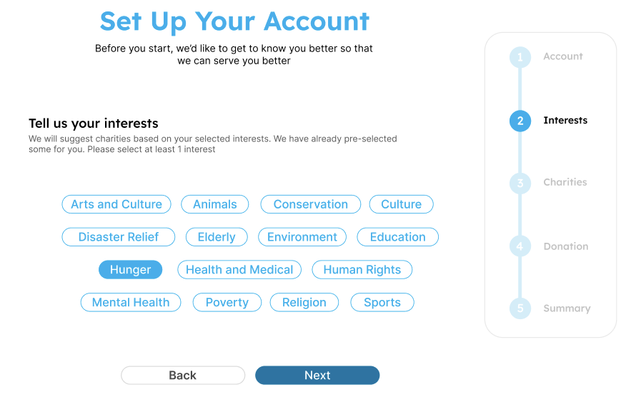
This stage shows the interests pre-selected by CharitAble based on the user's spending habits where they are also given the option to make changes to these pre-selected interests. However, unlike the previous prototype, the top spending categories are not shown which addresses the feedback concerning redundant spending categories from the previous prototype. Similarly, users can proceed to the next stage by clicking "Next".
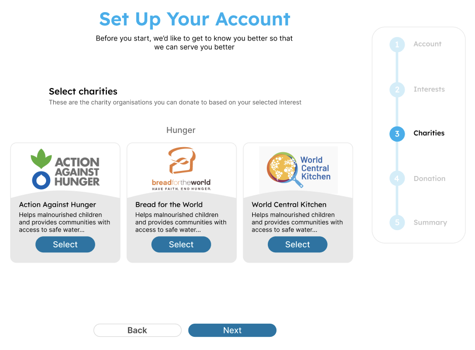
During this stage, a list of charities will be presented based on the interest selected in the previous stage. Unlike the previous prototype, users will not allocate the donation percentage. Instead, they will simply need to select the charities they are interested in supporting. This modification addresses user feedback from the previous prototype, where confusion arose from the combination of charity selection and donation percentage allocation. Upon clicking "Next", they will be directed to the next stage, donation.
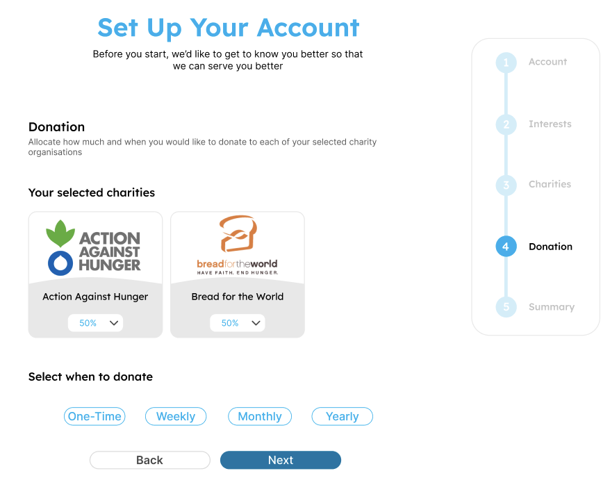
After selecting the charities, CharitAble automatically divides the donation amount equally among the chosen charities. However, users still have the flexibility to adjust the allocation amount if they wish. This approach was inspired by prototype 1, where 80% of the users preferred CharitAble to handle the donation split automatically. Additionally, users now have the opportunity to select their preferred donation period. This new option enables users who wish to contribute more frequently to do so, empowering them to make a more significant impact with their donations. Once they have allocated, they can simply click "Next" to proceed to the final stage.
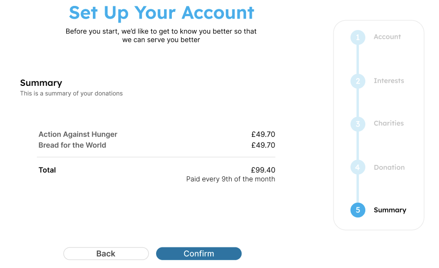
In contrast to the previous prototype, this version includes an additional stage that presents users with a summary of the selected charities and the allocated donation amount. Users now have the opportunity to review and confirm their donation details before submitting them. This new stage effectively addresses the feedback regarding the absence of a summary page, allowing users to double-check all their information before finalising the donation. Once users have confirmed their details, they can simply click the "Confirm" button, and their donation will be processed.
Conclusion of Prototype
In conclusion, the team's dedication to continuous improvement has led to the creation of an enhanced hi-fi prototype for CharitAble's donation process. Thorough consideration of user feedback and insights gathered during the user testing phase has resulted in a refined design with five well-defined stages, each thoughtfully presented with informative headers and descriptions. With a focus on user-centricity, the team has made significant strides in streamlining the donation process. Users can now conveniently set up their accounts and customize their donation preferences based on their interests and spending habits
With the main feature of the application already tested through this prototype, the team can now proceed to work on the remaining parts of the application, including the implementation of additional features and functionalities like the login process. With users' interests and preferences already saved, CharitAble is well-positioned to recommend suitable charities, effectively alleviating any dilemma users may encounter while making donation decisions. The successful completion of the main feature's design has laid a strong foundation for CharitAble's development, ensuring a user-friendly and impactful platform for charitable giving.
Try Our Prototype!
You can directly try this prototype below or if you would like to try it in the Figma app, simply click here