Exploring Prototypes and Refining Constraints
After doing the storyboard last week as our first prototype, we realised that it is limited in terms of how deeply we could explore our solution. Our creativity is slightly limited, since we know that Jane likes the idea of Geocaching and that limits the possibilities in terms of how people from the Geocache community navigate to the location of the murals/art pieces. However, what we do have control over is what these people do after finding the cache. We can explore this part of the user journey more creatively by prototyping for that specific part.
The question for our subsequent prototyping sessions then became:
How can we enhance the experience when people arrive at the site of the mural/art pieces?
("people" here refers to both the Geocache community and people who happen to pass by)
Revision in Constraints
Previously, we identified the following as constraints for our solution:
1. Solution should cater to everyone, including children and people who may not be able to use/afford smartphones
2. Solution should be easy for the staff to use and maintain
3. Use of technology in the solution should not dilute the sense of connection
After viewing the feedback on our weekly pitch 1, we reflected that it might be too ambitious to have our solution cater to everyone.
As such, we decided to revise constraint # 1 to the folllowing:
1. Solution should cater to people above 18, who may or may not have access to smartphones
We excluded the kids, since if they are under 18, they aren’t the target audience of the Annexe Communities anyway.
Recap of Needs
1. Showcase stories behind the art pieces and share about The Annexe Communities
2. Allow the public to contribute their own stories too
3. Attract more youth, dismiss the stereotype that the activities there are only for the elderly
Outcome
Inspired by the video on the Nike hands-free shoes, we focused our efforts on ensuring our solution caters to the hardest group to target - people without smartphones (subset of the people who just happen to pass by). People with smartphones may have more flexibility in terms of how they interact with the art pieces, but people without smartphones should still have an enjoyable experience. Assuming that smartphones should not be involved after the ‘?’ step in the user journey below, we went back to brainstorming and identified a few methods to encourage people to want to find out more about The Annexe Communities after visiting the art pieces.
(In the ideas at the bottom half, yellow = caters to those without smartphones, green = caters to Geocache community, blue = caters to both)
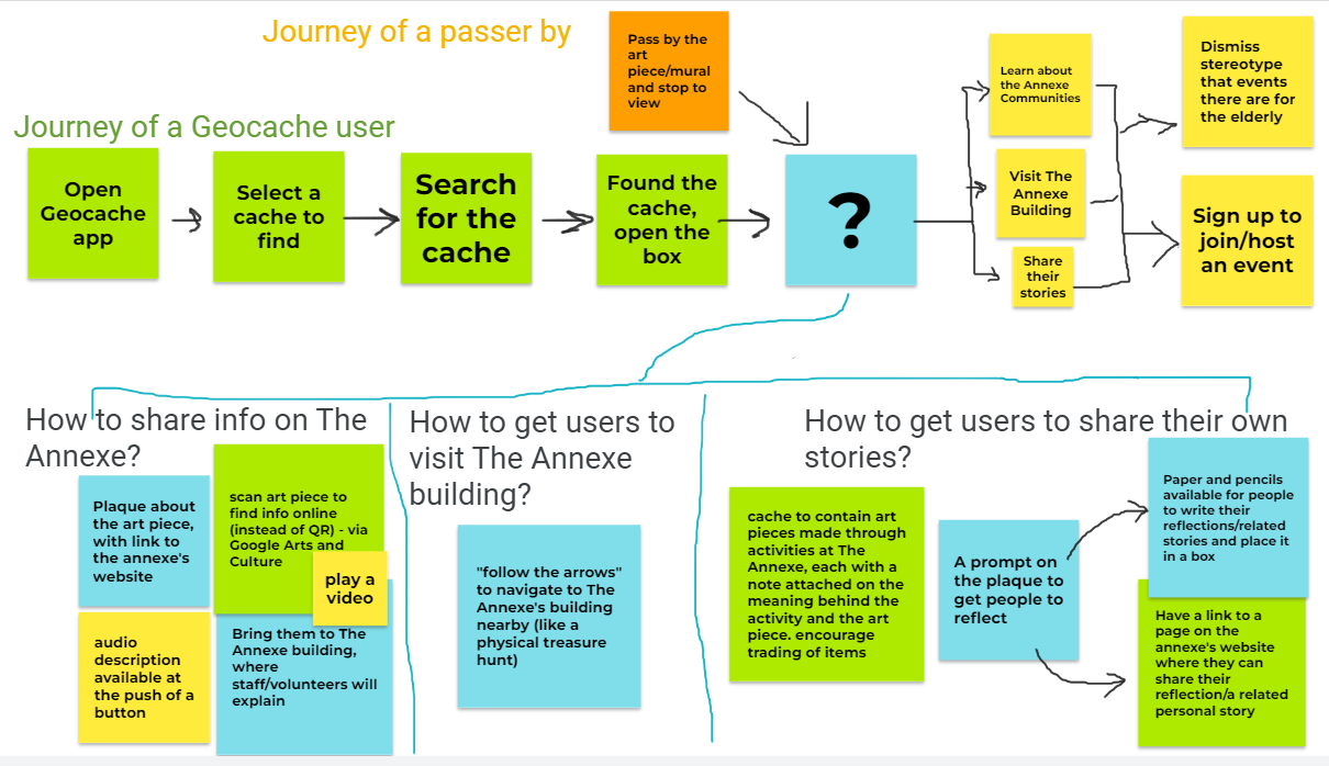
We created a few more prototypes based on these ideas (storyboarding and paper prototypes).
Tomorrow, we plan to design the tests for these prototypes and select the best one, then work on physical prototypes that we can use to demonstrate to Jane when we meet on Wednesday, to get more focused feedback from her. If time permits, it would also be good to test the prototypes on willing participants, to get feedback from not only the perspective on the Staff, but also of the potential end users.
